Streamlined payee management in Profiles
Saving time and effort for compensation admins by streamlining common payee management tasks in Incent’s Profiles.
Overview
Managing payees in Incent—Xactly’s flagship product for implementing and managing incentive compensation—is a key activity for compensation admins. Incent’s Profiles consolidates payee information from multiple areas in the product. It started out as a way to view information but admins wanted the ability to make edits without having to navigate away.
I designed the experience for multiple tasks in Profiles—including drag and drop experiences for managing a payee’s place in the hierarchy and their indirect crediting relationships—but for this case study I’ll be focusing on the work I did for changing a payee’s position.
My role
- UX designer
Teammates
- Product Manager
- Engineering
Goal
Reduce the amount of time and effort it takes to change a payee’s position.
Process
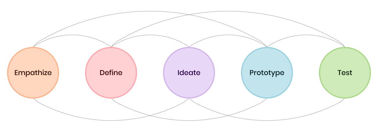
I followed a typical, non-linear design thinking process to effectively frame the problem and iteratively build understanding to create a solution.
Framing the problem
Ramping up and creating alignment
Because I was working with a short timeline, I utilized existing research to facilitate conversations with the team. This was also my first time working on Incent so to ramp up and kick off the work I completed four groups of activities: Understanding the user, understanding the product, analyzing the current experience, and aligning the team.
Understanding the user
- Reviewed admin persona
- Reviewed surveys and fact base
- Reviewed feature suggestions
- Talked to internal experts
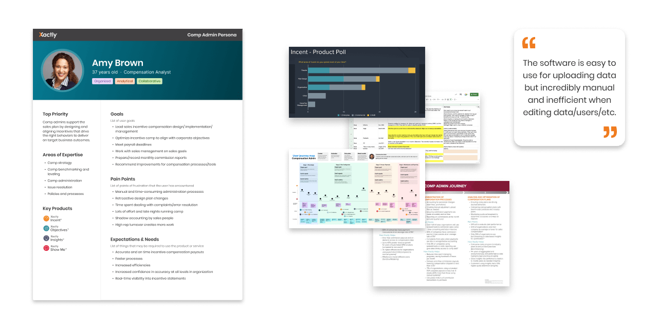
Understanding the product
- Completed product walkthroughs
Analyzing the current experience
- Performed heuristic evaluation
- Mapped out the flow
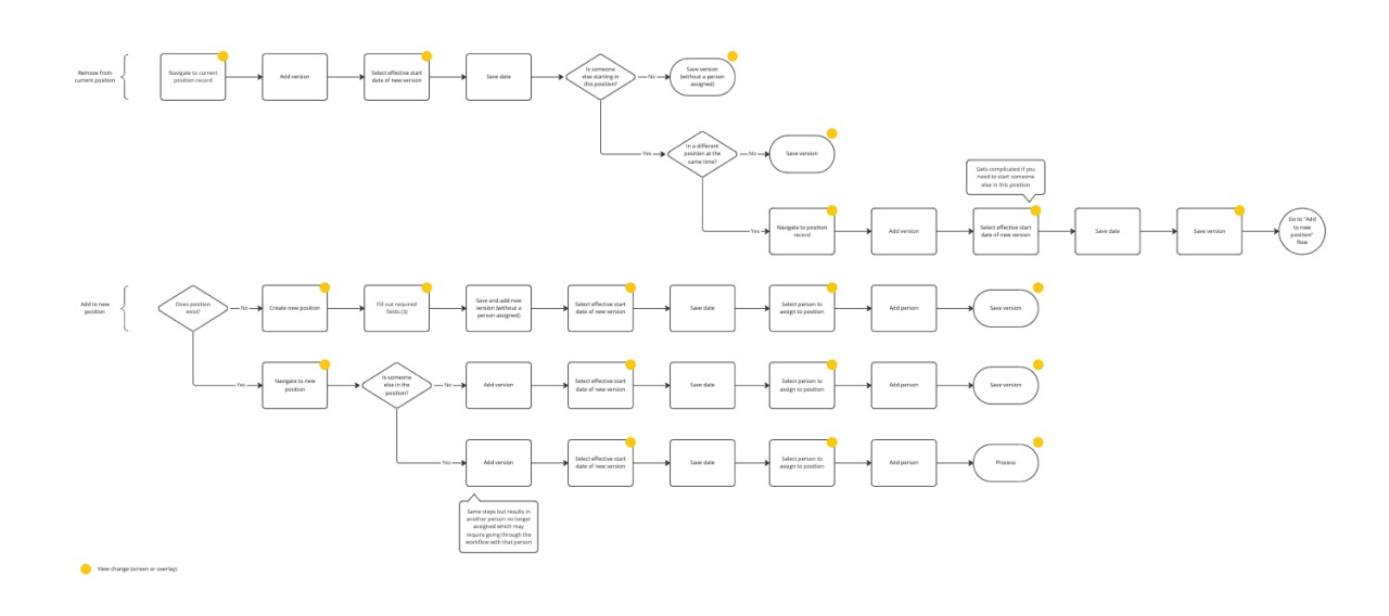
Flow diagram of current steps to change a position
Aligning the team
- Presented findings and information
- Framed the problem with the team
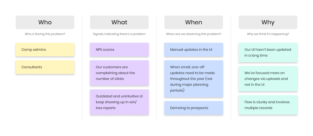
Project framing board
Learnings and problem statement
All of this initial work allowed me to better empathize with our admins and be more effective as I started design exploration.
Learnings
- The Organization tab is the 3rd highest area where admins spend the most time
- Time-consuming administration processes are a large pain point for admins
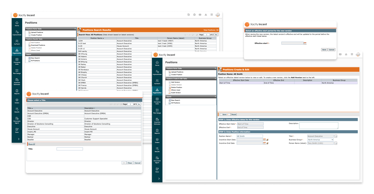
- For a large number of changes, admins use the upload process, and for a small number of changes, admins make the change in the UI
- The task in the current UI is a minimum of 12 clicks with multiple pages and modals
Problem statement
With the help of the problem framing activity, we aligned around a problem statement.
Problem statement
Compensation admins spend too much time changing a payee’s position because the product requires multiple disjointed steps and recalling payee information.
Initial exploration & validation
Exploring a solution
In the current experience, admins needed to work in the Position records page to change a payee’s position. Profiles is looking at a payee’s information from a different perspective—the payee itself. After brainstorming some ideas with the team, I started exploring a solution that took the currently separate steps and tied them together into a single dedicated flow.
Flow diagram v1
Exploring design ideas
I shared my work early and often with the team. Through the process of exploring and sharing ideas, I discovered that I could combine some of the steps to create a more streamlined flow.
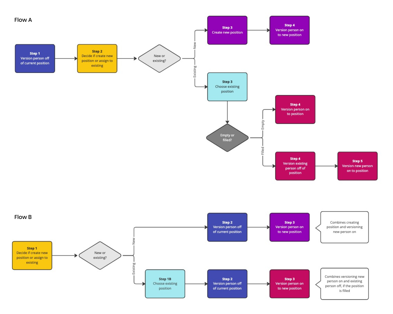
Flow diagram v2: Combining steps
I ended up with two design variations: 1) a multi-step flow; 1) a single-step form. In ordered to get quick feedback on the direction, I prepared the designs to present to a group of internal experts.
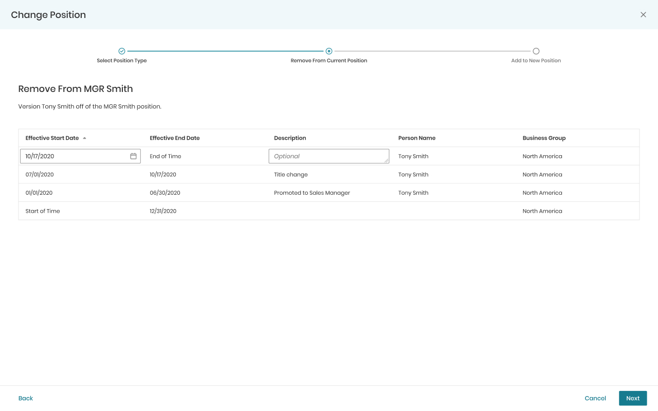
Design variation 1: Multi-step flow
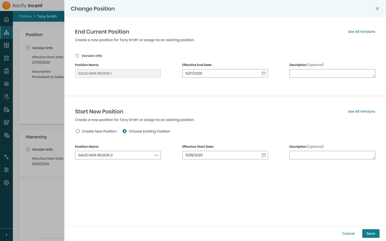
Design variation 2: Single-step form
Testing with an internal focus group
I was able to utilize a focus group made up of internal users and experts from across multiple departments to get a quick initial read on the design direction, which was vital to getting early validation and maximizing the limited time I had to complete the work.
Learnings
- We were solving the right problem
- They loved not having to create the initial effective version
- There was no preference between the two flows
- Hardly any customers reuse positions
Applying the learnings & testing with admins
Refining the solution
The positive reaction around removing a decidedly unnecessary step made me question if we could do more to streamline the task. After additional sketching, diving deeper into versioning and position changes, and discussions with the team, I created a new flow that further simplified the process by matching the way people think about the position change rather than the steps the system requires.
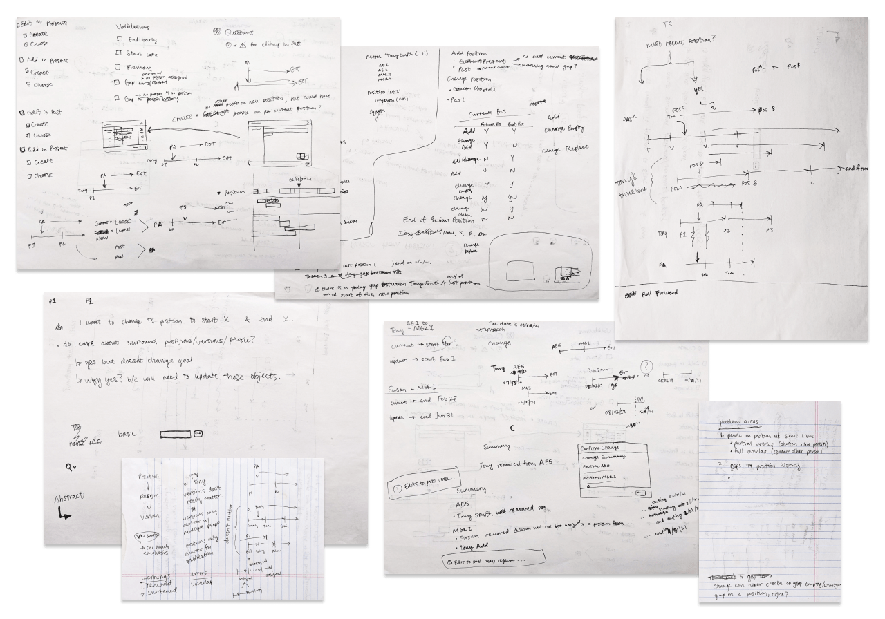
Flow sketches and versioning notes
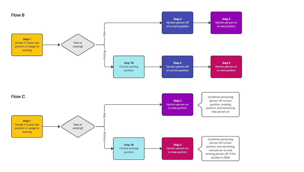
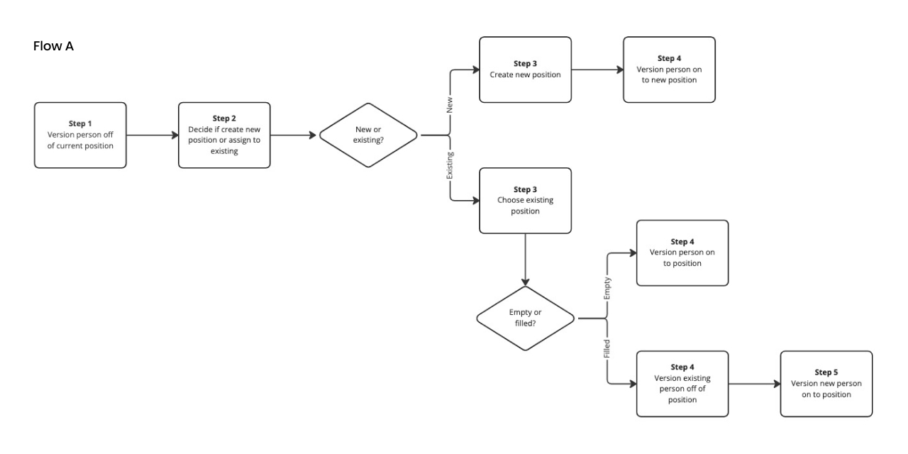
Flow diagram v3: Combining more steps
Based on the number of customers reusing positions and our best practices, it was clear the new simplified flow that made sense for the majority of customers was worth any trade off for the very small number of customers reusing positions. I explored flows that optimized for reusing positions but as a team we decided the value didn’t match the effort. Instead, we decided to monitor to see if further optimization is needed in the future.
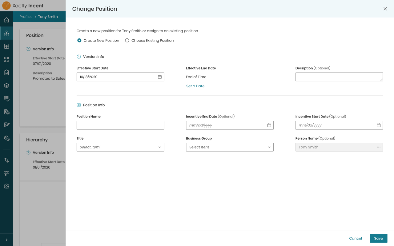
Create new position
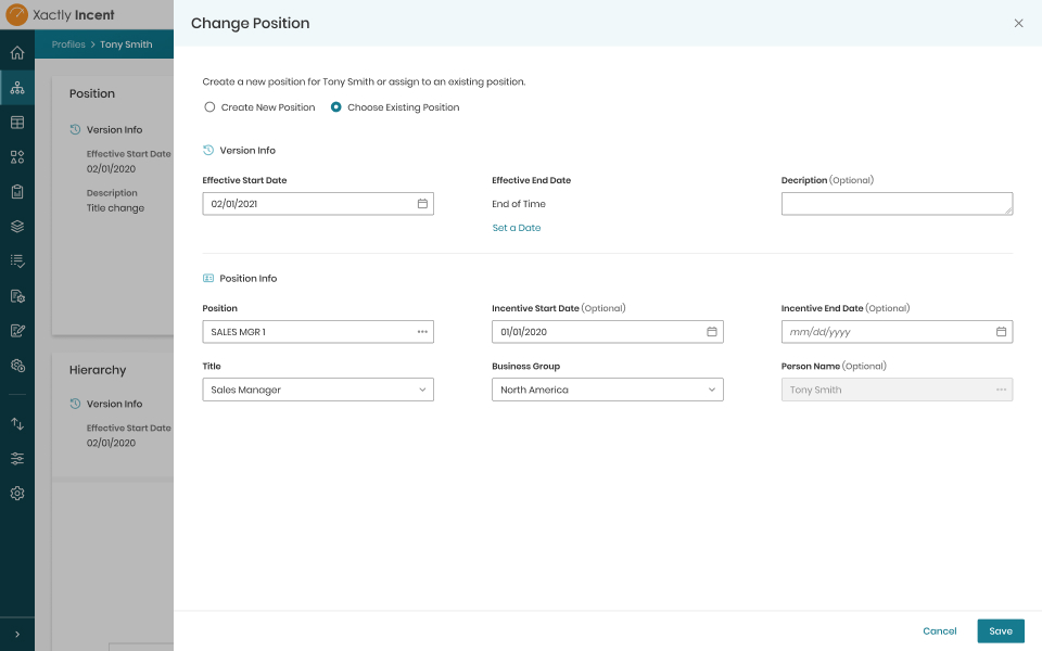
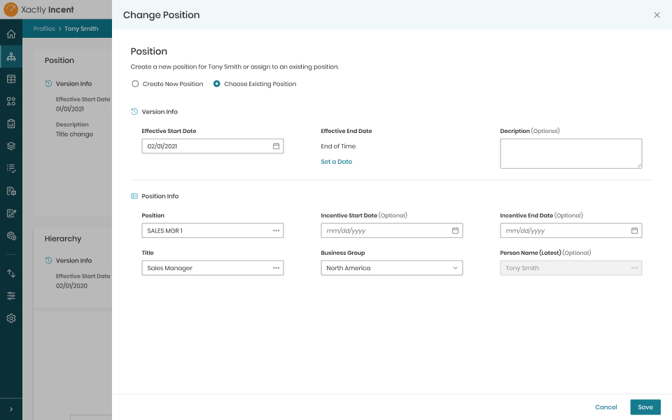
Choose existing position
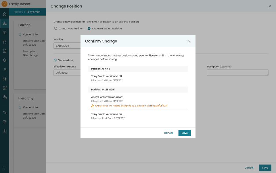
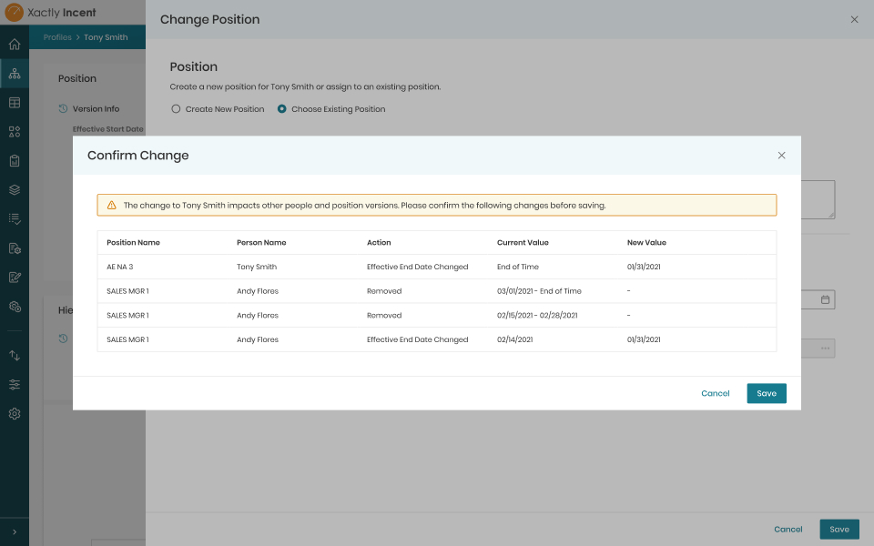
Position change confirmation
Testing with admins
I made the assumption that admins didn’t need to see every piece of information, and because of that, I knew it was important to get the design in front of admins for feedback. We tested the design with multiple admins and received positive results.
Learnings
What we learned about admins:
- Loved not having to deal with as many effective version
- Didn’t have an issue with the consolidated view
- Some wanted an easy way to reference previous position information
- Didn’t need the full version history
- Often times much of the information for the new position change is the same as the old one so not having to fill in or reference the duplicate information would save time
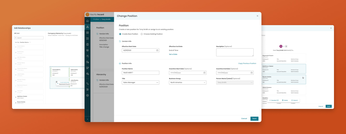
Final solution
Overview
We moved forward with the tested solution but with two changes: We added a button to fill the form with the data from the previous position based on the feedback we received and we changed the confirmation model to show all the versions impacted instead of a summary.
Although the summarized version of the confirmation modal was more concise, it was negatively impacting development time so I worked with engineering to find a solution that was clear and would work for the majority of admins.
In addition to designs, I created different scenario diagrams to make sure all use cases were covered and there was clear understanding on what needed to be build and tested.
With each iteration, the solution moved farther from how the system expected the inputs to how the admins thought about a position change.
Create new position (video)
Choose existing position
Position change confirmation

Outcome
Result
We delivered an experience that better matched how admins thought about a position change and that dramatically reduced the number of steps by using smart defaults and relying on the system to do more work. Along with the other tasks I worked on for the Profiles area, the feature contributed to an increased usage of Profiles and overall product value.
4 clicks
Reduced the task from a minimum of 12 clicks to 4 clicks and from multiple pages and modals to a single view
+4.4% adoption
+22.6% visits
Increased the overall usage of the Profiles area
Next steps
From the total work done in the Profiles area, we found that some admins weren’t aware of certain time-saving features, especially related to hierarchy management. We’ll be working with the training and enablement teams to improve the awareness of the new features in Profiles and monitor for a change in usage.
Bonus
Preview of the hierarchy management enhancements
The hierarchy section of Profiles is another area I worked on. Although I don't have a full case study prepared, I'm happy to share some of the in-progress design I created to communicate ideas and collaborate with a distributed team. The new experience greatly streamlined certain hierarchy management tasks for admins, saving them precious time, especially when using the roll changes forward feature to fix mistakes in the past (from hours or even a day's work to minutes).
Various interactions I designed (video)
Rolling changes forward (video)