UX Standards: Design Documentation & UI Kit
When I started working at Bass Pro Shops, there was no style guide or design documentation for their website. I did considerable work to create and define UX standards to help improve consistency and efficiency for the UX team.
The Project
First, a Little Background
In September 2017, Bass Pro Shops acquired Cabela’s, and when I joined in July 2018, the UX team was still in a state of transition as they were beginning to find their new place after the merger. Because Bass Pro Shops did not have a UX team, the UX team at Cabela’s was tasked with supporting Bass Pro Shops. One of the projects that was discussed early on was developing UX standards for Bass Pro Shops.
Project Deliverables and Goals
Two Deliverables
In the initial phases of the project, it was pretty clear that there would be two main deliverables.
-
Design Documentation
Explaining the what, why, and how of the components
-
UI Kit
A collection of components
Top Three Goals
After the project was started, we spent some time as a team evaluating the initial standards as well as defining goals for what the UX standards should accomplish.
-
Consistency
Create consistency and a better experience for our users
-
Efficiency
Increase efficiency for the UX team and other teams
-
Communication
Improve communication for all teams with a shared language
My Role
I began working to create and define UX standards early on which resulted in me taking the lead in this initiative. While I did a lot of the ground work (updating the design of UI elements, writing documentation, and creating the Sketch Library), I relied on my team members for feedback on the design, functionality, and relevance of the standards and their usage.
The Process
Research and Planning
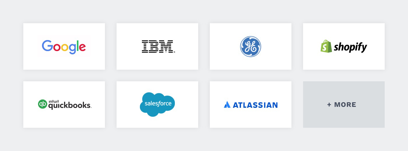
Coming from an agency that did a lot of branding, I had a strong grasp of brand and style guides but was not very familiar with design systems. At the beginning of this project, I spent a lot of time reading about design systems and exploring public designs systems from companies like Google, IBM, GE, Shopify, Atlassian, QuickBooks, Salesforce, and more. I gained a lot of insight from seeing what other companies included in their design system and how they organized their content.
My original aspiration was to build a full-fledged design system but discovered this would be out of scope for the time being. Through much research and many conversations with my team members, it became clear the best approach would be to create a UI kit with supporting design documentation. This would be faster to create and would allow us to get much needed standards in place and eventually get buy-in for a design system.
Change of Tools
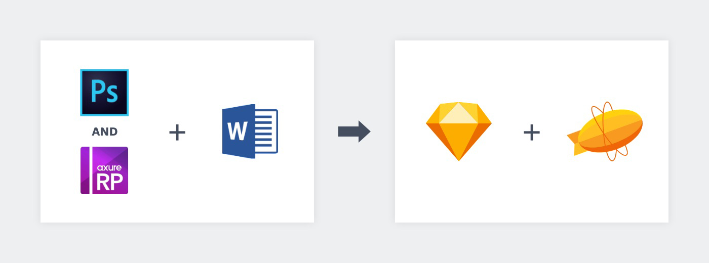
When I started working at Bass Pro Shops, the UX team was using Photoshop and Axure for UI design and would document design handoff details in Word for certain projects. While changing tools wasn’t fully a part of this project, it was the perfect time to look at the current tools the team was using. After evaulating other tools, we decided to make Sketch our primary UI design tool and use Zeplin for design handoff. During this time, I began researching design systems and style guides and experimenting with symbols in Sketch.
Discovery and Early Designs
Visual Audit
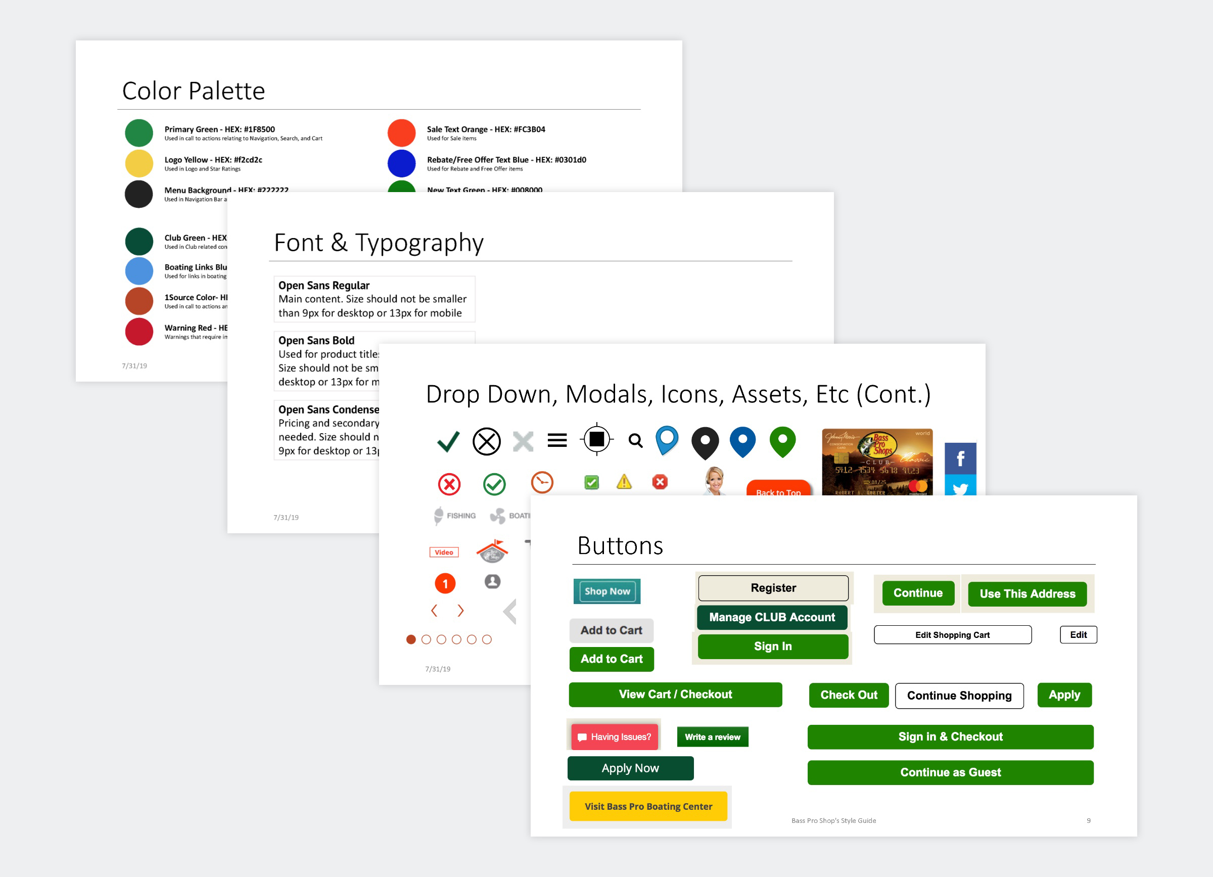
One of my team member conducted a visual audit to help the team understand the styles used on the website and some of the discrepancies that existed.
Grids and Spacing
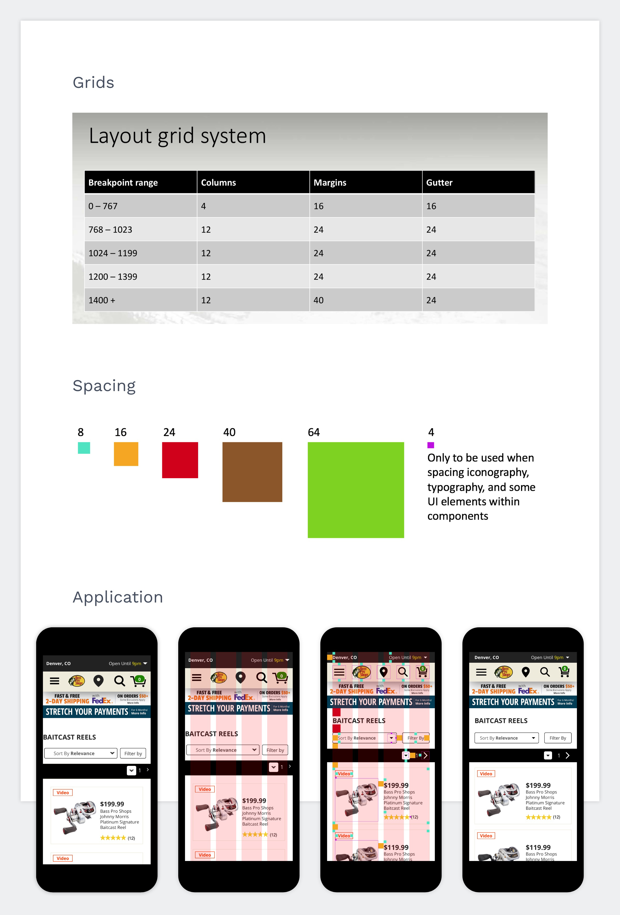
One of the first bits of discovery I completed was for grids and spacing. I wanted to establish guidlines for grids and spacing early to help align the team and improve the site's consistency.
Colors
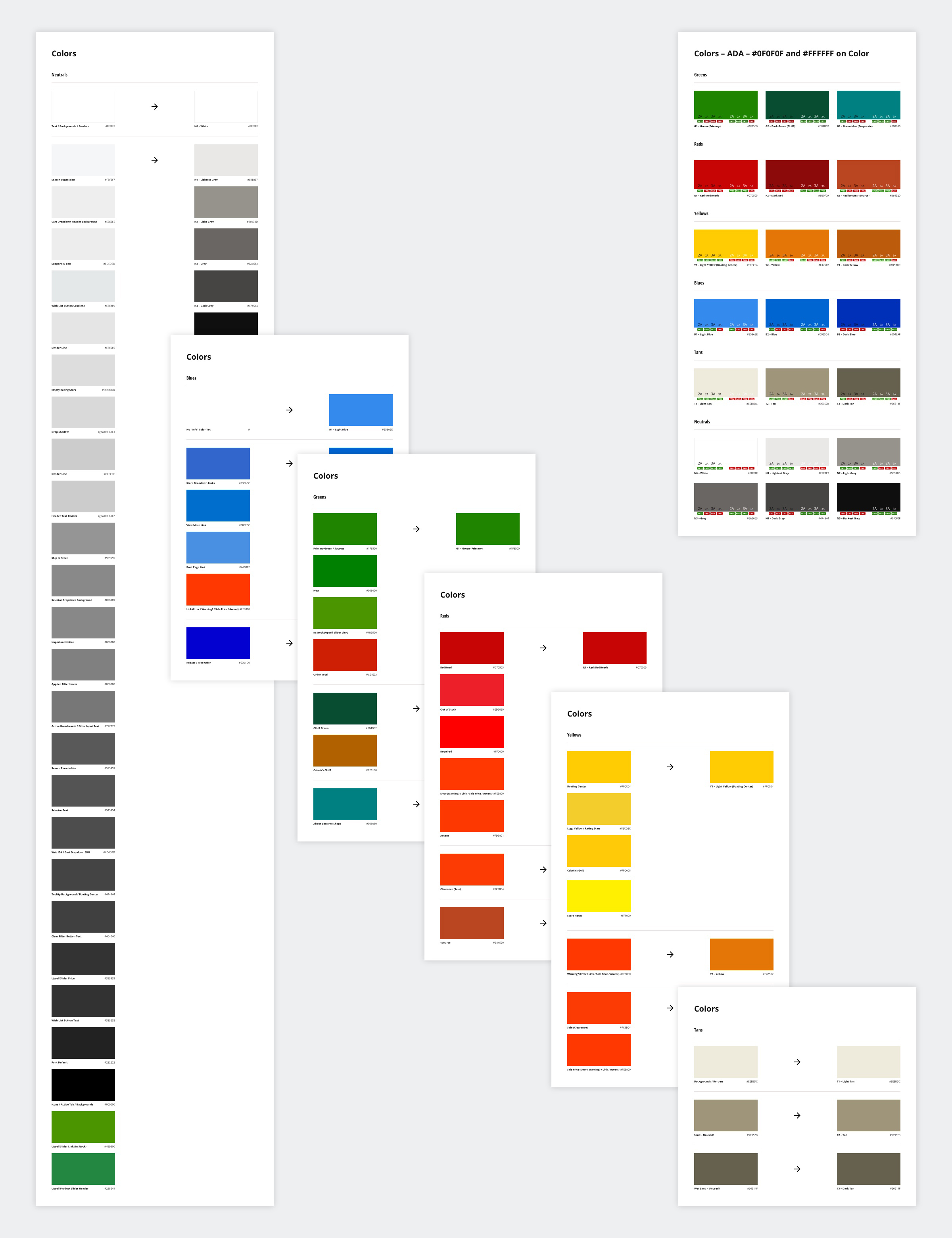
Bass Pro Shops had an established marketing color palette but I quickly discovered it did not always translate to the website. I evaluated the colors being used, consolidated colors when possible, and made necessary color updates to pass accessibility contrast ratios
The Deliverables
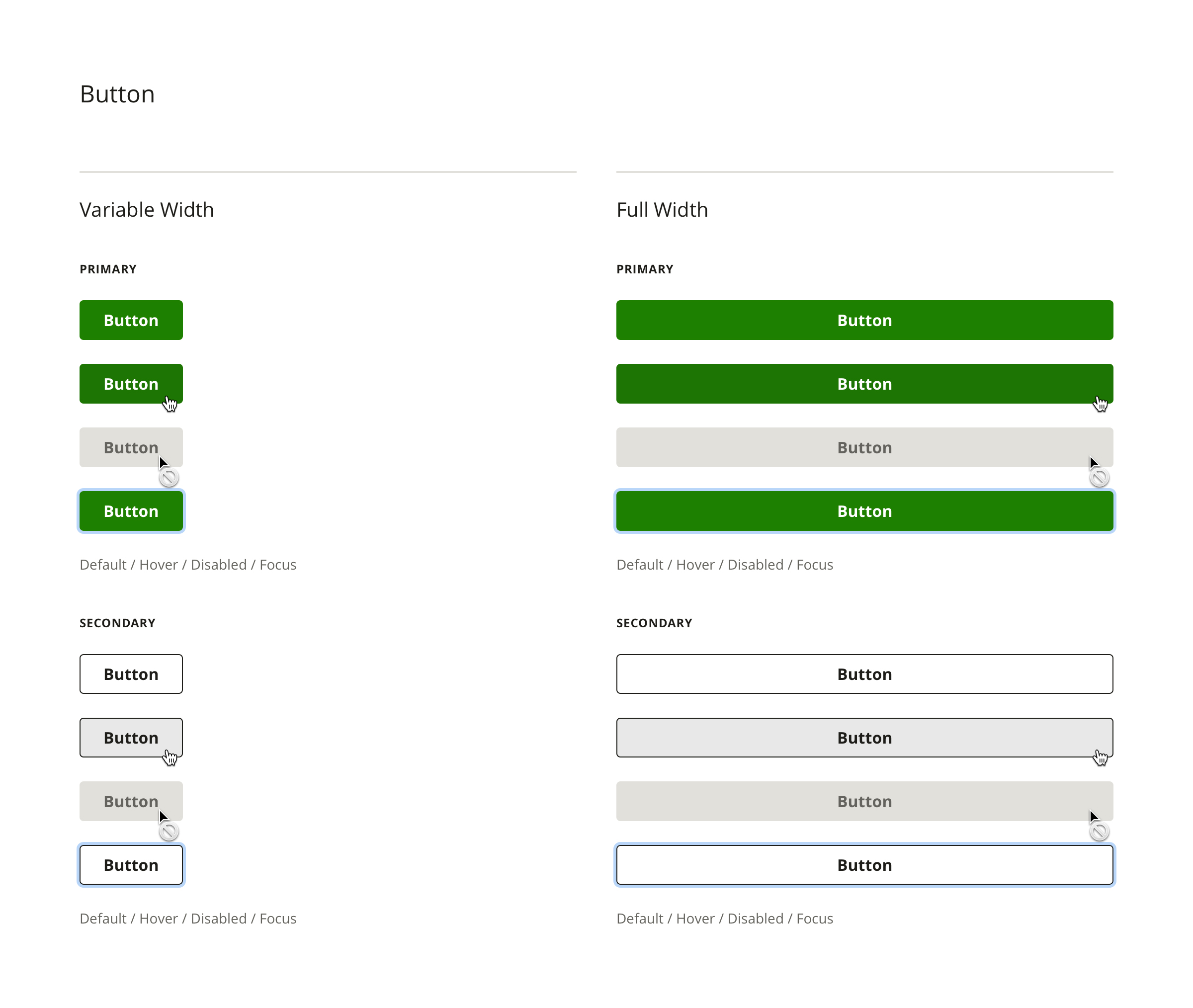
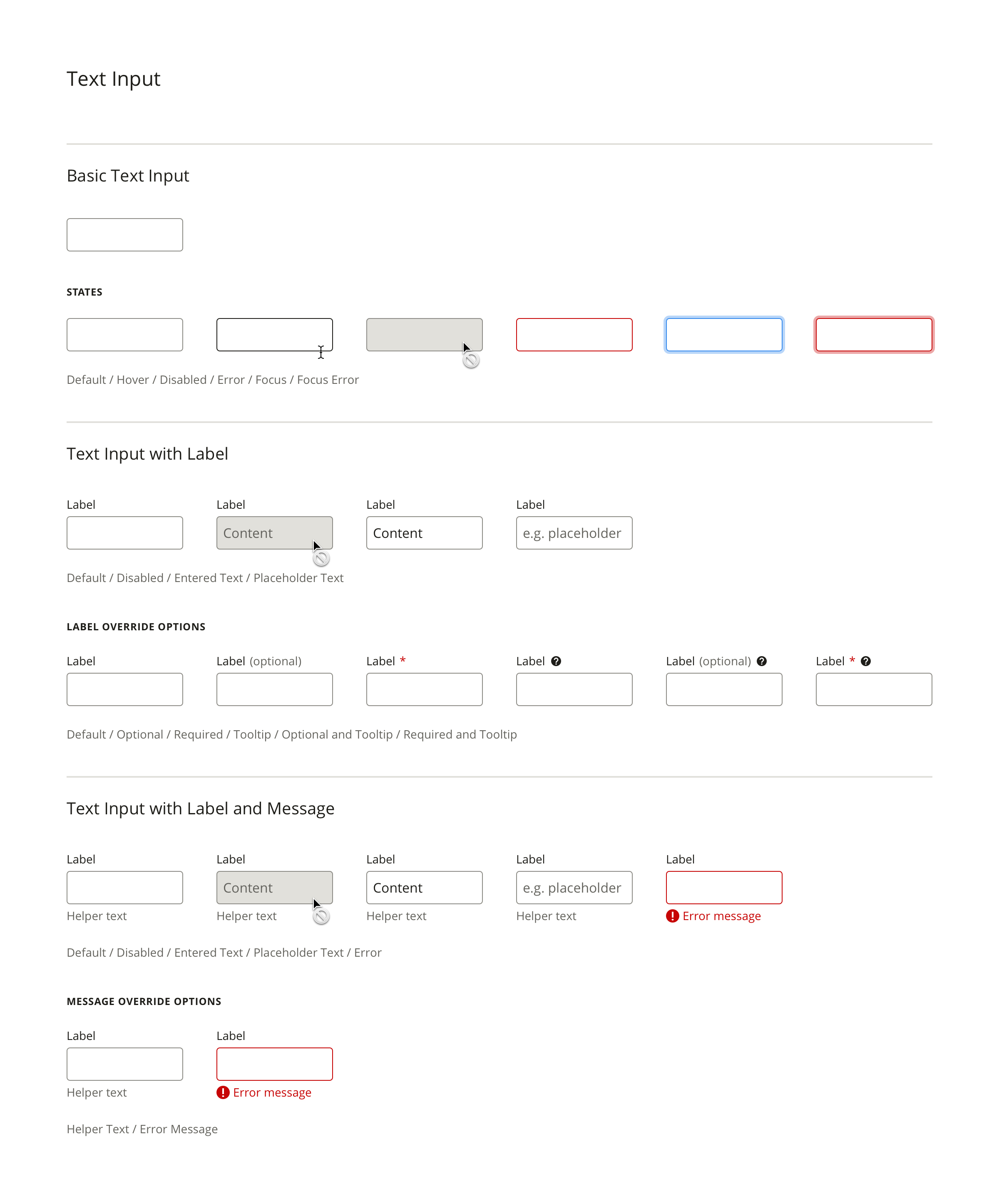
Design Documentation
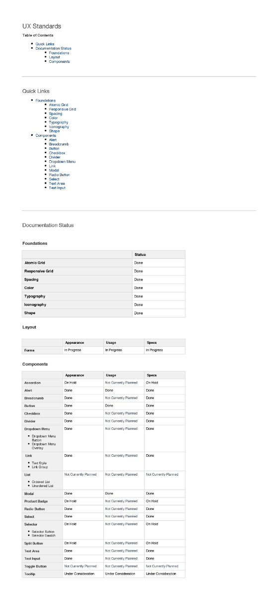
Because of time and resource constraints, it was decided that Confluence would be the best place to house the documentation for the UX standards.


UI Kit
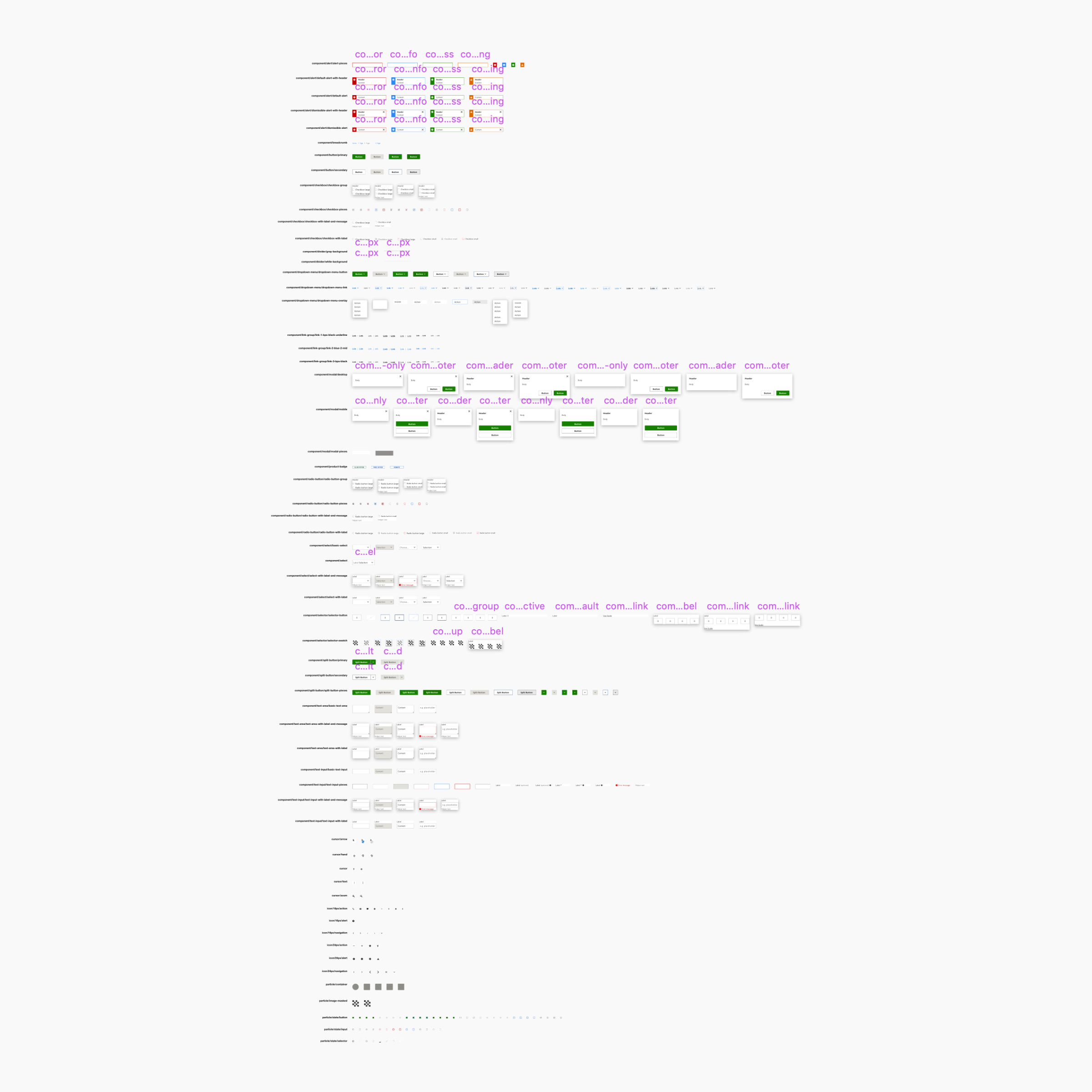
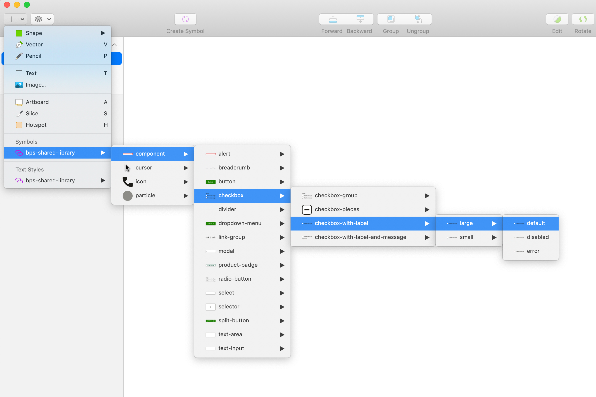
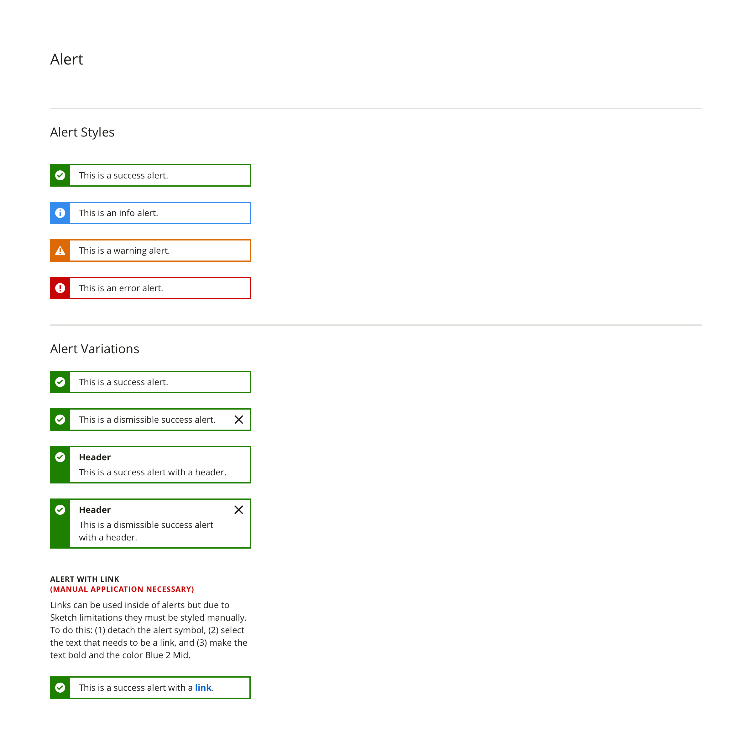
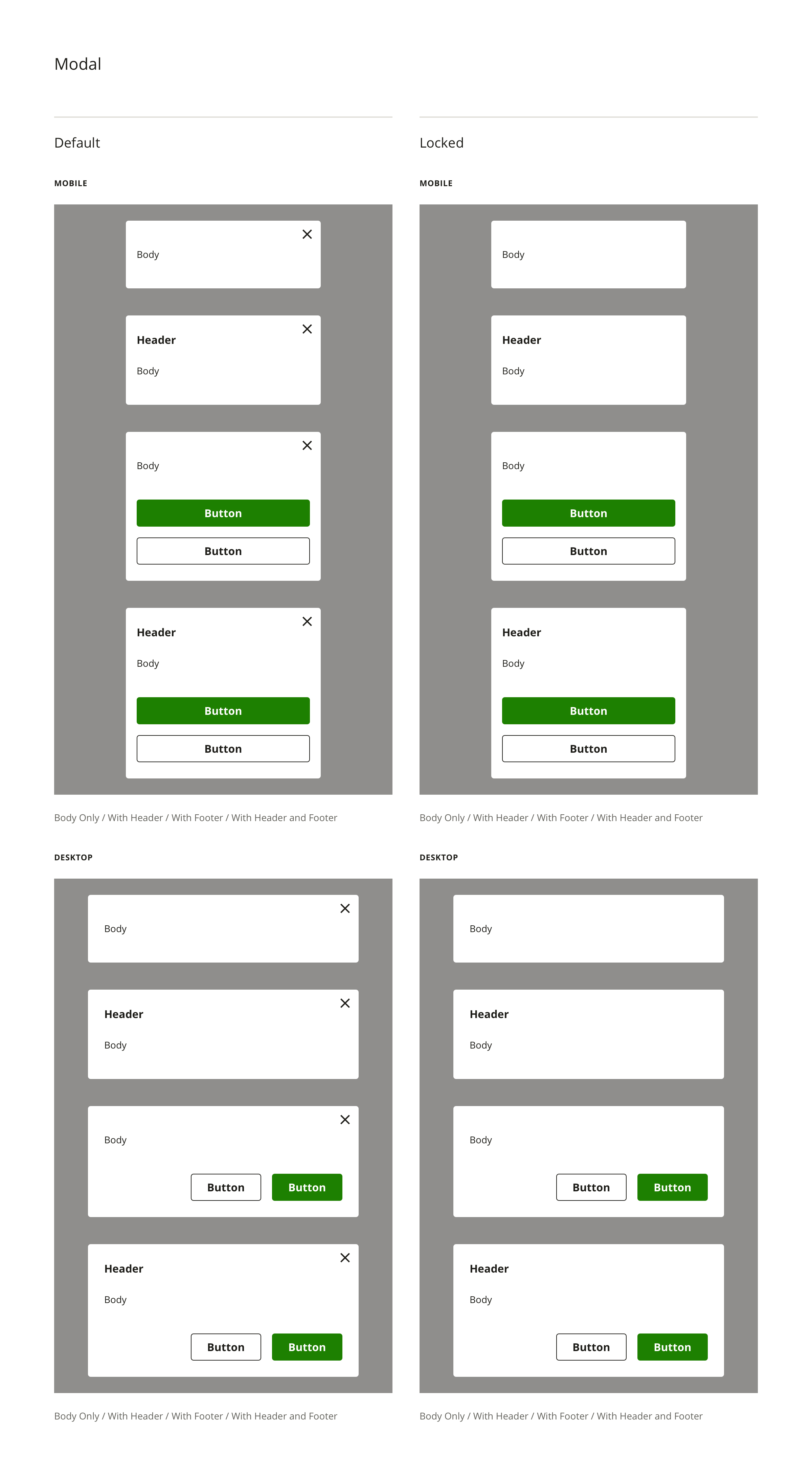
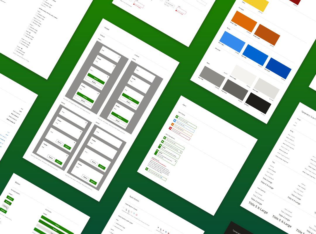
The UI Kit is a Shared Sketch Library for the UX team to use in all projects as well as to reference all of the permutations of a given symbol. The goal of the UI Kit is to speed up design time and promote consistency.
